ShopDreamUp AI ArtDreamUp

Deviation Actions
Daily Deviation
Daily Deviation
October 22, 2013
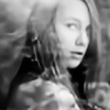
The city of chains. by `dragonfly-oli is a powerful tangle of natural forms; an abstraction with a strong conceptual narrative, helped in no small part by the evocative choice of title.
Featured by arctoa


Suggested Deviants


Suggested Collections


You Might Like…


Featured in Groups


Description
I cannot wait to get my new lens! 


Wow, thank you for the DD-feature!
 Featured: hanketsu1717.deviantart.com/jo… justynastolyhwo.deviantart.com… fav.me/d5g3a7c fav.me/d652nbk fav.me/d65wadm fav.me/d6rqb3i fav.me/d6s950z fav.me/d6trzh9 fav.me/d6ubweh
Facebook | 500px | Tumblr
Wow, thank you for the DD-feature! 
Facebook | 500px | Tumblr
My pictures may not be reproduced, copied or stolen in any way!
© Olivia Michalski, all rights reserved.
Image size
2650x2650px 947.74 KB
Make
NIKON CORPORATION
Model
NIKON D5000
Shutter Speed
1/500 second
Aperture
F/9.5
Focal Length
200 mm
ISO Speed
400
Date Taken
Nov 25, 2011, 12:16:42 PM
© 2011 - 2024 OliviaMichalski
Comments136
Join the community to add your comment. Already a deviant? Log In
I don't usually do reviews, but this got a DD, so I felt it needed one.
There are a lot of aspects I like about this photo. Whether the grainy appearance was intentional or not, I think it works here. The muted, dull colors work well with the abstractness and darkness. The title adds vision, I think, as titles can be really important to abstract photos sometimes. However, I dislike the composition. The large, blackish blue thing at the top is distracting. It should be cropped out. I think that a landscape format would work much better for this than square. It would eliminated the darkness at the top and open up the photo more, giving the viewer a wider, more inviting range to look at. In addition, the way the large bunch of out of focus branches overlaps the branch in the front is something I find distracting as well. Since there is so little color/darkness difference between the out of focus branch and the in focus branch, it makes it hard to focus on the branch that is in focus, so my eyes don't really know where to go in the photo. I think if the point of view had been shifted, so that the in focus branch and out of focus one were more separated, perhaps only overlapping at the bottom, it would be much better. A final thing is that you could maybe play with the curves and brightness a little to key up the lighting, while still keeping the darkest parts dark. This would give it drama and impact, but still maintain dreary and monotone look.